Stella app
Menopause care · Product design · UX strategy
CONTEXT
Stella is an online clinic dedicated to women’s health, with a specific focus on menopause care. Its mission is to help women feel better during menopause and support long-term health later in life.
Care is delivered through two main channels: a website and a mobile app. On the website, users complete a free medical questionnaire that informs their clinical assessment. While clinical care continues in the background, users are encouraged to download the Stella app and begin their self-care journey immediately.
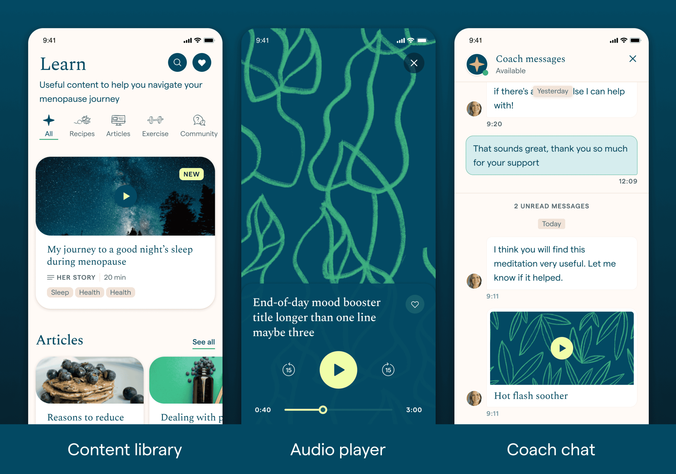
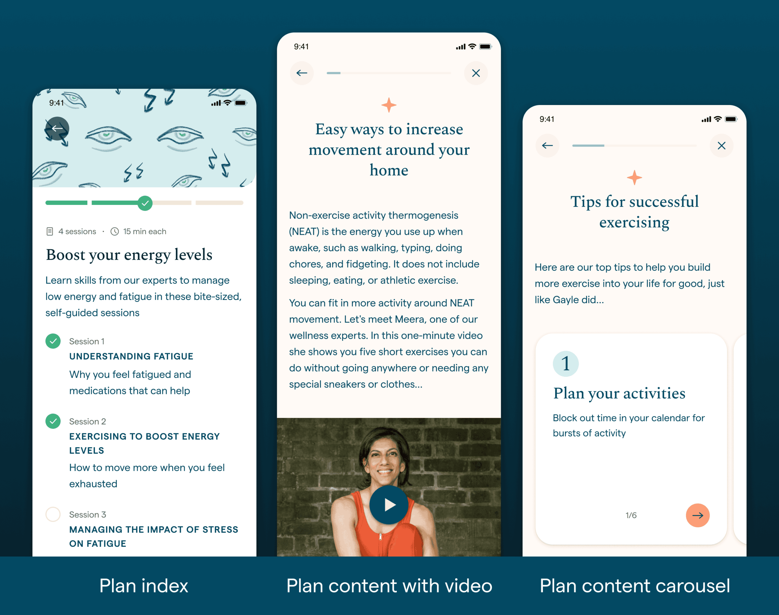
The Stella app provides personalised lifestyle plans tailored to each user’s symptoms. These plans combine educational content — scientific information, real-life examples, tips, and habits — with a large library of menopause-specific resources (articles, recipes, exercises, and more), as well as access to expert chat support.
Plan completion is directly linked to symptom improvement and is the primary metric used to demonstrate Stella’s efficacy. For this reason, the work described here focuses specifically on improving plan engagement and completion.
Initial version
The first version of the app followed a traditional Cognitive Behavioural Therapy (CBT) structure, based on an ideal therapeutic timeline.
- Each user received a plan covering up to three symptoms
- Each symptom included four weekly sessions
- Full completion took 12 weeks
- Content unlocked weekly
- At the end of each session, users were encouraged to adopt new habits until the next session became available
Insights from data & research
What was working:
- Users were highly engaged with the plan content
- The mix of scientific information, real examples, and practical tips resonated well
- Symptom metrics showed improvement over time
- The tone and quality of content made users feel supported and empowered
What wasn’t working:
- Plan completion rates were very low
- Most users dropped off after the second session
- Some users felt unsure about what they were “expected to do” when opening the app
CHALLENGE
Menopause is a deeply personal experience, with symptoms and needs varying significantly between individuals and stages. This variability has long been a challenge in diagnosis and treatment — and it needed to be reflected in the product experience.
Although we had access to behavioural data, deeper insights emerged through user interviews. I worked closely with User Research, creating visual aids and interactive prototypes to support testing and validation.
Key learnings:
- Users at different stages of menopause have very different needs
- Many users arrive feeling overwhelmed and vulnerable
- The experience must actively guide users toward symptom improvement
- Support means empowering choice, not enforcing structure
- Restrictions create confusion and increase frustration
SOLUTION
I began with a thorough evaluation of the entire plan experience — from symptom reporting and plan recommendation to unlocking logic and long-term progression.
All findings and proposals were clearly documented in shared design files so that anyone in the company could follow the reasoning. I regularly presented early layouts and concepts to the wider team (Founders, Product, Engineering, Content), which helped reduce friction, align scope early, and incorporate feedback before development began.
First iteration: Quick wins
The initial changes focused on removing friction quickly while maximising impact:
- Removed the weekly cadence › users could now access a symptom plans at their own pace
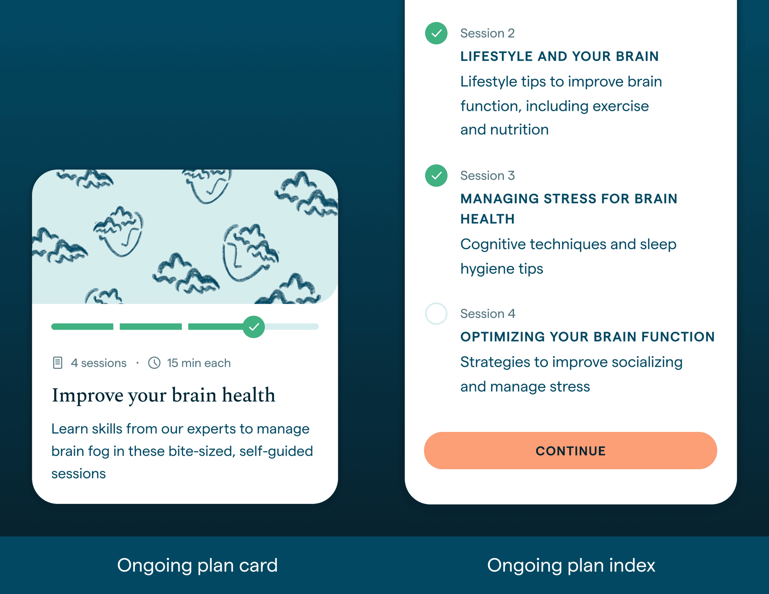
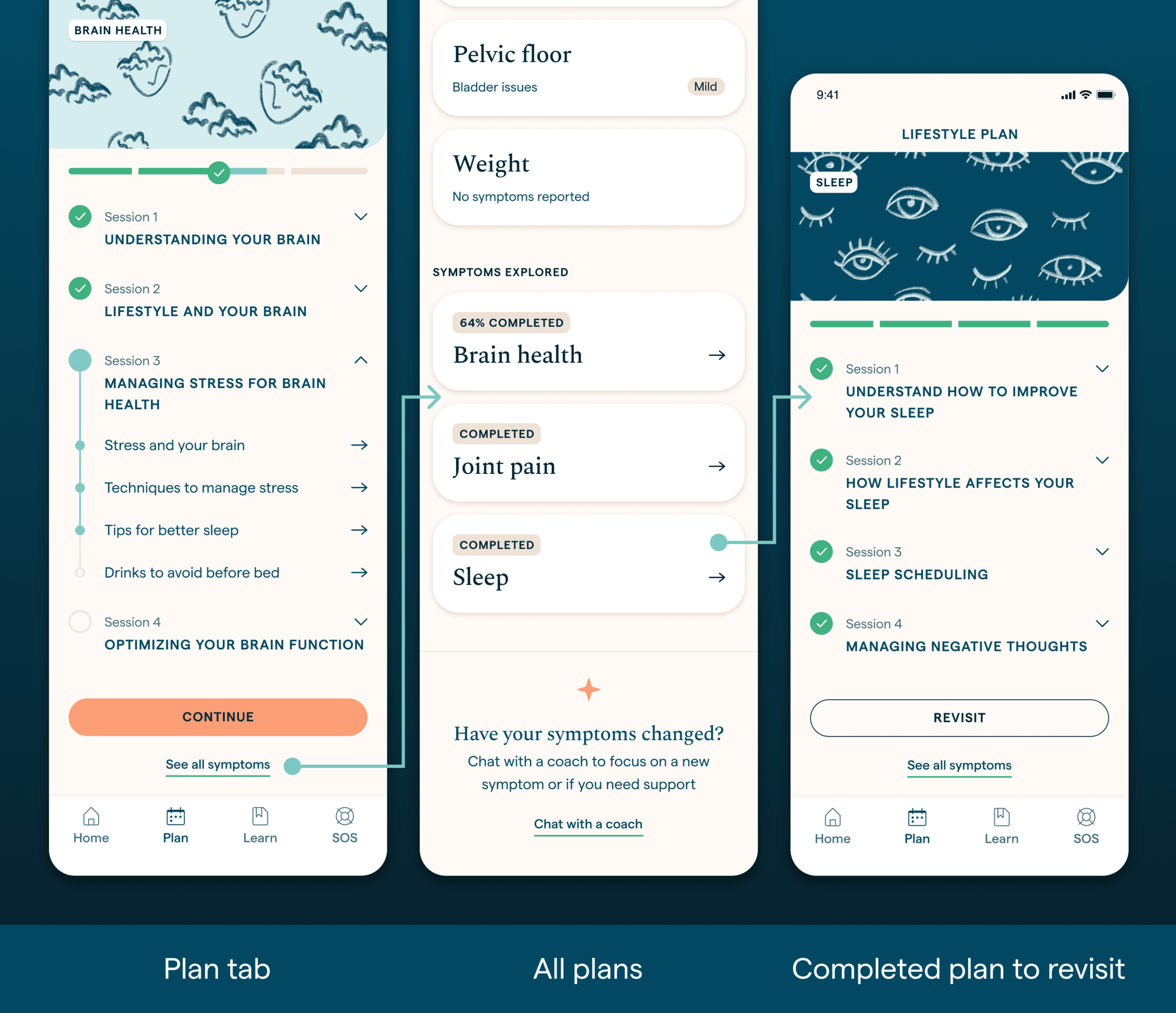
- Completed plans would be hidden after completion › we made the plans available to be revisited, at any point
- Users could access only one symptom plan at a time › all symptom plans where made visible and available in the app
Second iteration: Structural & interface improvements
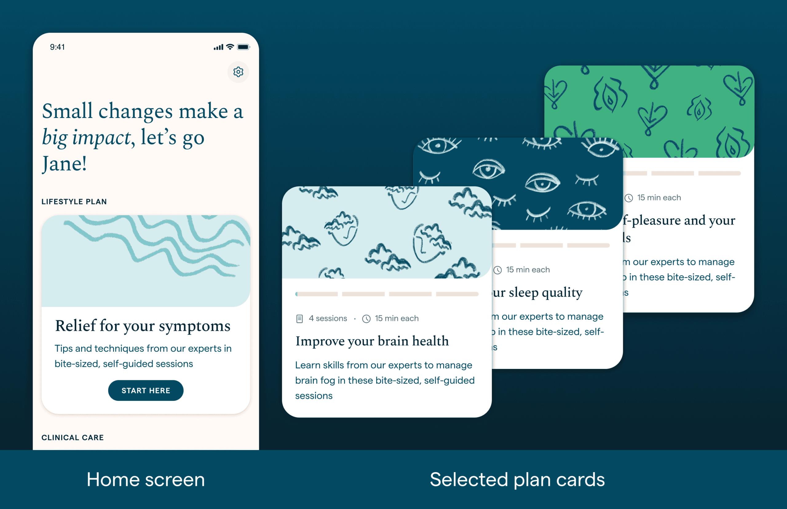
- Plan journey was made intentional, not imposed › plans only started by user choice
- The home screen was simplified to a single call to action › labeled “Start here” button will take users to the plan picker flow
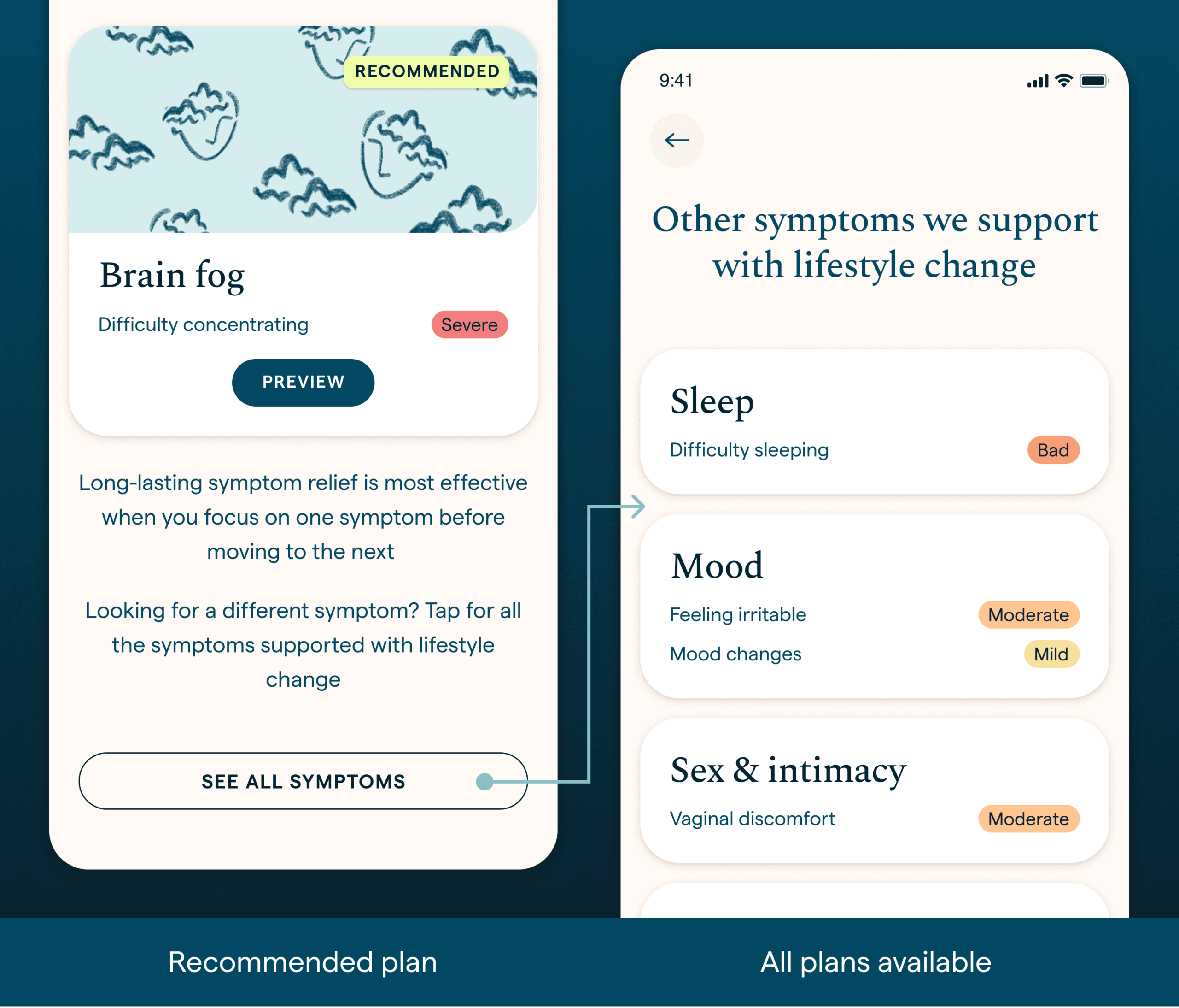
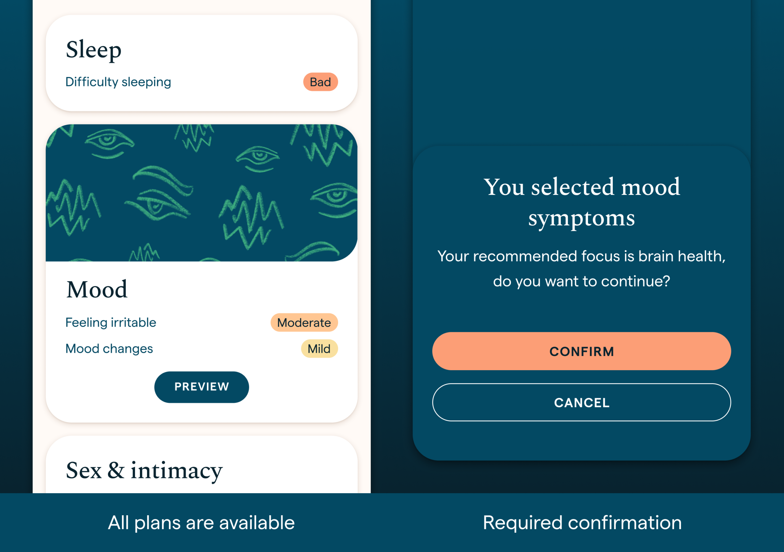
- Plans recommendation was more clear › showing symptoms and severity
- Only one plan was recommended › while all plans were available to start from
- Once a plan is selected, it’s card is updated in the home screen › this card show’s progress and is a shortcut to continue the plan
- Symptom plans were all available from the Plans tab › with a visible status of completion and progress
- Feedback and guidance were reinforced › tooltips and decision screens were added in key steps
Alongside this work, I collaborated closely with the content team on plan reviews, usability improvements, and richer media integration.
Outcome & reflection
Completion rate and symptom improvement are still the key metric for success. To make sure these changes had a positive impact, we need to keep track of users interactions with the plans. In conclusion, most of these changes were focused in removing friction, being more transparent and by consequence, give users more freedom and power over their symptoms.
YEAR
2024
TOOLS
Figma