Briefing
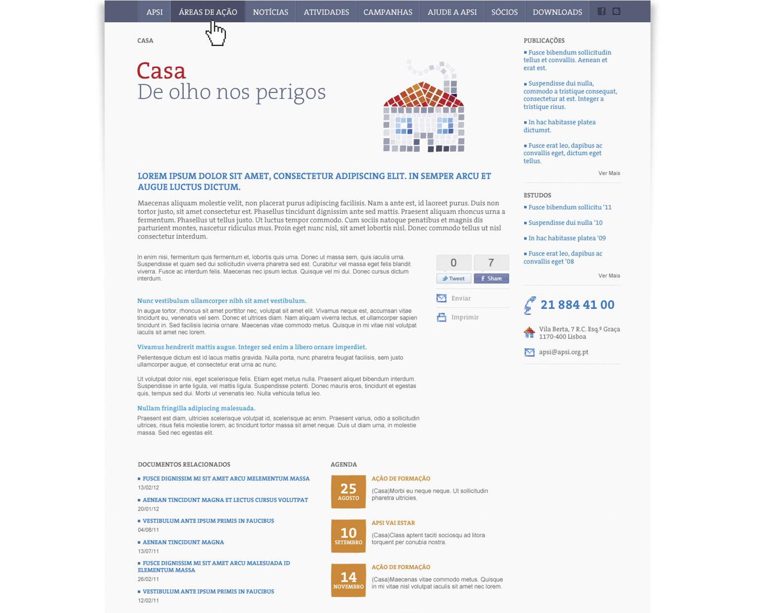
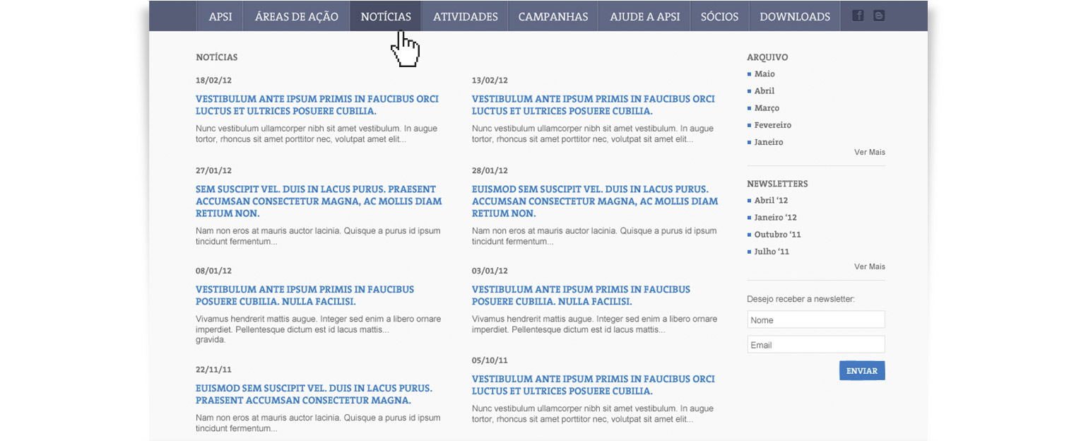
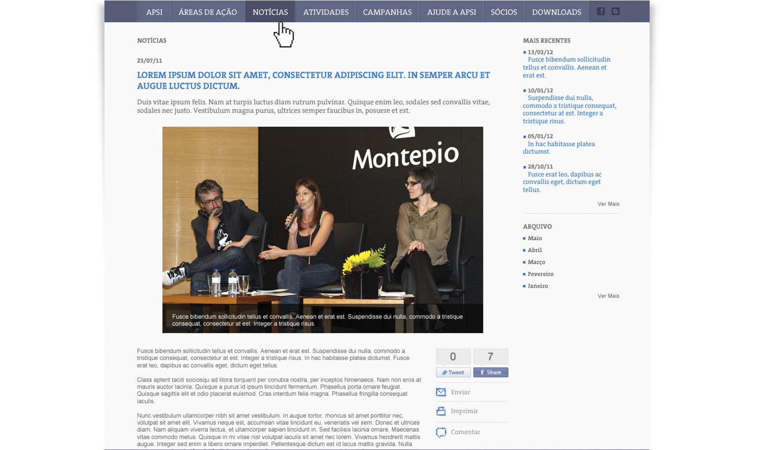
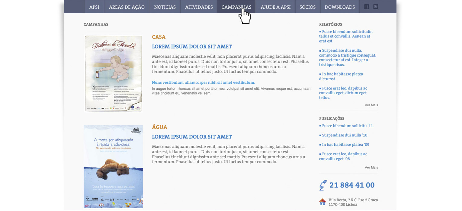
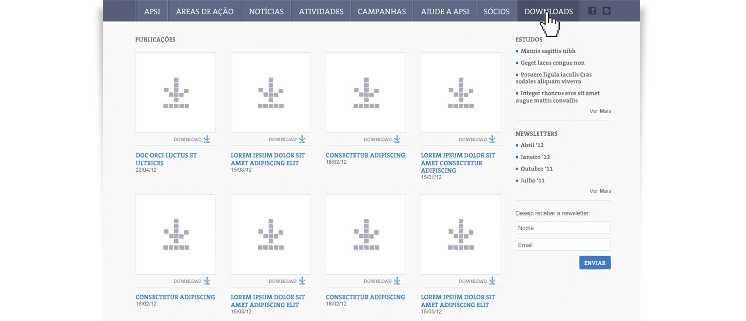
In pair with the redesign for the 20 years of the brand, the website needed to be redesigned. With the growth of the organisation throughout the years, the website had lost all the content logic and grew into a very messy website, making life harder to the users and people in APSI to update content.
Result
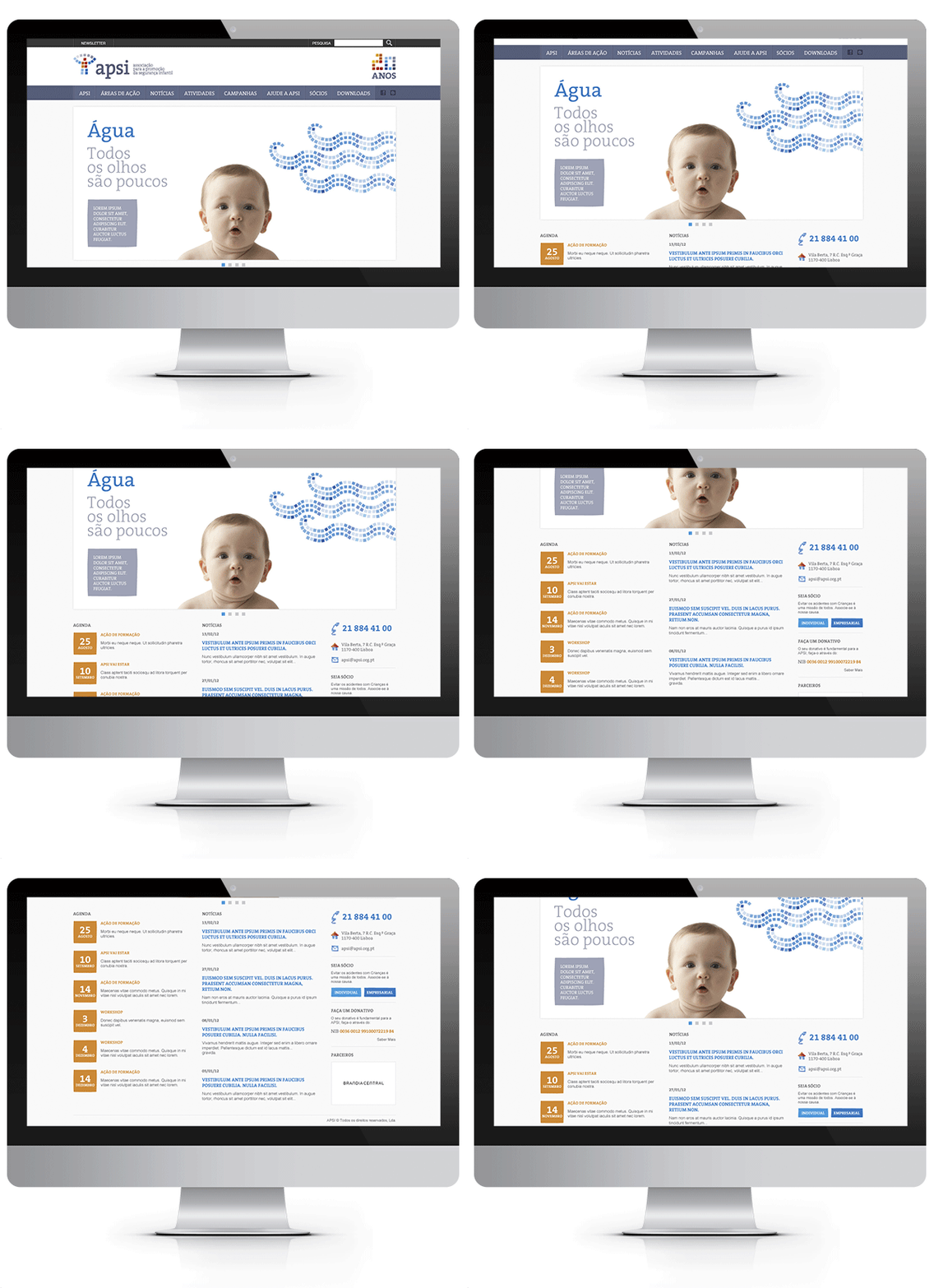
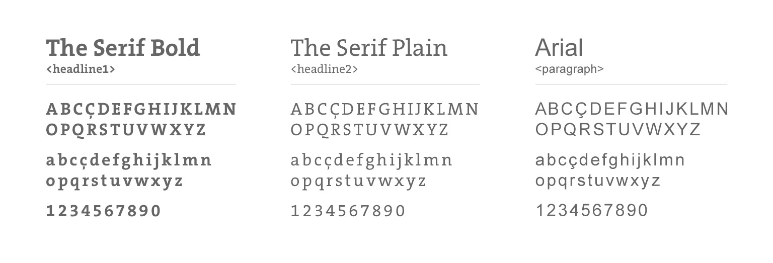
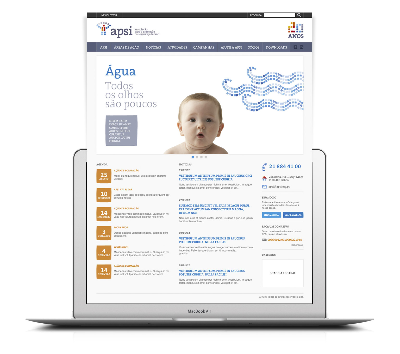
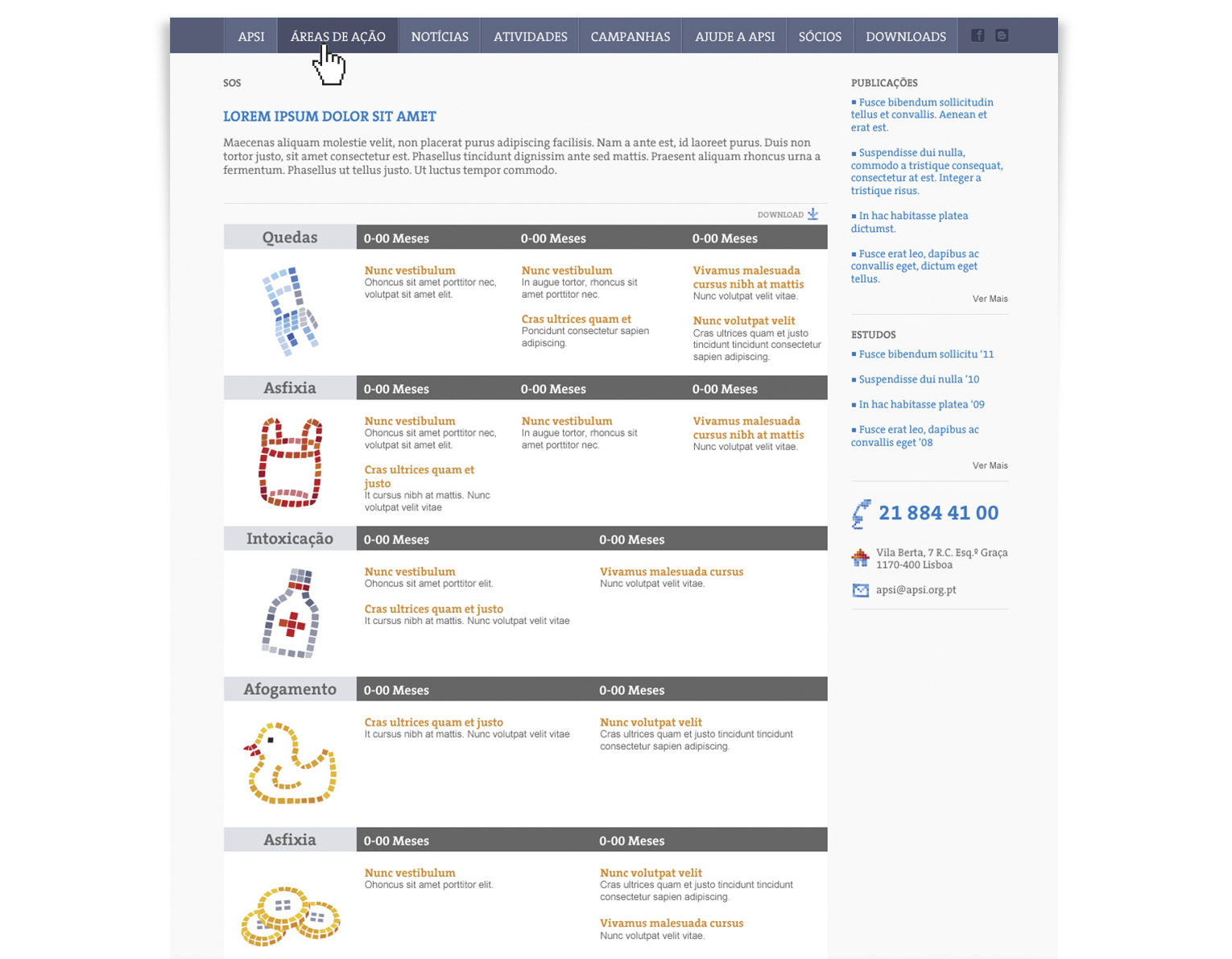
Using the new brand designed with new colours and fonts defined, and a clean look and feel. The starting point was a big review to all the content needs. A new information architecture defined and site map was created. I designed a few template pages to serve all the content needs. As result we end up with an easily updatable pages and smooth user experience for the website.

